Posts

How to calculate power with welch t-test formula

This is based on a two-tailed T-test when the two groups have different mean and variance.  power_cal_welch_t_test <- function (mean_control,mean_treatment, sample_size_control,sample_size_treatment, sd_control, sd_treatment) {   m2 <- mean_treatment   m1 <- mean_control   n1 <- sample_size_control   n2 <- sample_size_treatment   s1 <- sd_control   s2 <- sd_treatment   true_mean <- m2-m1   se_pool <- sqrt(sd1*sd1/n1+sd2*sd2/n2) ## Below is the welch t-test degree of freedom   degree_of_up <- (sd1*sd1/n1 + sd2*sd2/n2)^2   degree_of_buttom <- (sd1*sd1)^2/(n1*n1*(n1-1)) + (sd2*sd2)^2/(n2*n2*(n2-1))   degree_of <- degree_of_up/degree_of_buttom   ## End of calculating degree of freedom   t_critical <- abs(qt(0.025,df=degree_of))   margin_error <- t_critical*se_pool   t_left <- (-true_mean+margin_error)/se_pool   t_right <- (-true_mean-...

Monte Carlo Simulation and Risk Analysis of Bitcoin

Image
Note: This post does not represent any expert guidelines in finance or bitcoin. This article is a wrap-up of a class project regarded stock market risk analysis.  – Data Preparation from Stack Overflow: link – language: Python – Example code for Stock Market Project, Inspired by Jose Portilla’s Github Repo TL;DR The daily return chart shows that 25% of the time it's around 0%. The tail of the daily return is very long, as much as 400%. The Monte Carlo simulation shows that we will have between $5600 to $9000 range. The most interesting part is here. If we look 10% empirical quantile of the final price distribution to estimate the Value at Risk for the Bitcoin price, which looks to be $925.49 for every investment of $6837.31, which accounts for 13.5% of the investment.  This means that for every initial coin you purchase at 6837.31, $925 is at risk 90% of the time from Monte Carlo Simulation. 

Automatically download finance data via Google API

As Yahoo! Finance deprecated the API in late 2017 and Google changed their Finance URL, below is an alternative to download finance data. from pandas_datareader.google.daily import GoogleDailyReader @property def url(self): return 'http://finance.google.com/finance/historical' GoogleDailyReader.url = url # get data import pandas_datareader as pdr from datetime import datetime start = datetime(2014,1,1) end = datetime(2018,2,5) ret = pdr.get_data_google(['FB'], start, end) Reference Documentation about other alternative API for downloading finance data  here GitHub discussion about Google new Finance URL  here

How to convert milliseconds or seconds into date format in Presto?

Milliseconds: DATE_FORMAT(FROM_UNIXTIME(column_name /1000),'%Y-%m-%d') Seconds: DATE_FORMAT(FROM_UNIXTIME(column_name),'%Y-%m-%d') Please note that '/1000' should be added when it converts milliseconds to human-readable format.  We have the column " purchased_date_epoch " stored as numeric format. Let's say we want to convert the " purchased_date_epoch " column value " 1442287036 " to  human-readable  format.  SELECT purchased_date_epoch FROM table                               return: 144287036  SELECT DATE_FORMAT(FROM_UNIXTIME(purchased_date_epoch),'%Y-%m-%d %T) return: 2015-09-15 03:17:16                                          SELECT DATE_FORMAT(FROM_UNIXTIME(purchased_date_epoch),'%Y-%m-%d)    return: 2015-09-15            ...

How to perform two-sample one-tailed t-test in Python

Image
In python, we can use ttest_ind   to perform two-sample one-tailed test. Assuming that our hypothesis are: Ho(Null Hypothesis): P1 >= P2 Ha(Alternative Hypothesis): P1< P2 In this case, we know that we have 1st normal distribution with mean equal to 3 and variance equal to 2 with 400 data points. The 2nd normal distribution has the mean equal to 6 but the same sigma and size as 1st normal distribution.  How can we interpret the results? According the  Stat Trek , when the null hypothesis is: 6>=3, the t score should be equal to 21.2 with degree freedom equal to 798 and SE equal to 0.1414. Stat Trek Calculator gives use the p-value equal to 1. You might notice that no matter whether or not we write  ttest_ind(P1,P2)   or  ttest_ind(P2,P1)  , the t-statistics changes but the p-value does not change. Why? By default, Python Scipy library does not give an option for us to perform one-tailed two sample test. The p-value is compu...

Why do you need to take Tableau Certificate Desktop Exam?

You might already read my previous blog about How to prepare for the Tableau Certificate Exam . Before you invested time and money in the exam, you may have the moment when you are wondering if it's worthy to take the exam. The fact is that there are not many certificates in the market for data science. Tableau Software becomes a very popular business intelligence tool in the past couple years despite their decreasing stock price. According to the Tableau Report Fiscal Year 2015 , " 88% of Fortune 500 companies, such as Cisco, Wells Fargo and Capital One, use Tableau, which bodes well for our land and expand strategy".

How to Add Mixpanel or Google Analytics on a Shiny App Correctly?

Image
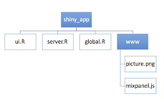
Before you start reading this post, I recommend to read this blog on shiny.rstudio.com about how to add a Google Analytics to your shiny app. It's vey likely that you followed all the steps on the blog but it did not work out.  3 steps are missing in the blog post on rstudio website. I will walk you step by step about adding Mixpanel on shiny correctly:

Data tells you the secrets of extramarital affairs

Image
Recently I found this interesting dataset about extramarital affair of women in 1974. The dataset was built under a survey and now is available to download via Pandas package in Python. Some interesting facts are discovered after pure data visualization. If you are interested in interactive dashboard, please click here . 

How to group the dimension and customize the group name in Tableau

Image
'Edit group name' is hidden in Tableau. Here is the instructions of how to group the dimensions and customize the group name. I used the default dataset of Superstore on Tableau Desktop 9 as an example. I want to group the sub-categories with number of records smaller than 200 together

What's the probability of forming a triangle by breaking a stick twice?

Questions: Supposed that you have 2 chances to break a stick with length of 1 into 3 pieces. What is the probability that the 3 pieces form a triangle? Code in Python: [in:] n=100 y>0 z>0 success = 0 fail = 0 n=1500 for i in range (0,1500):     x = rd.random()     y = rd.random()     if (y>0.5 and x<0.5 and y-x<0.5) or (x>0.5 and y<0.5 and x-y<0.5):         success = success+1              else :         fail = fail+1 probability = success/n print (probability)

Data Visualization with Seaborn in Python: FANG Stock Correlation Analysis

Image
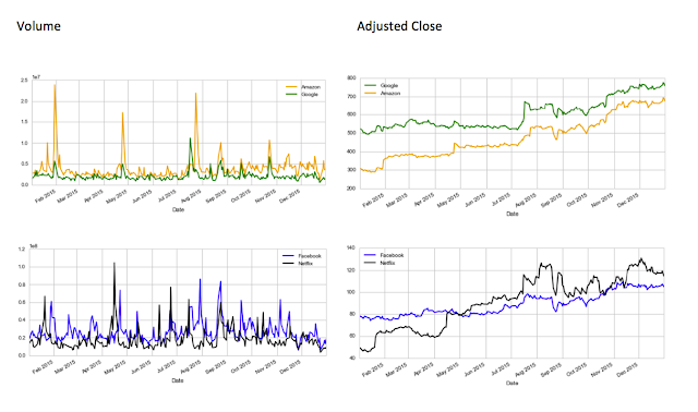
FANG, known as Facebook, Amazon, Netflix, and Google in the stock market, are considered very good investment in 2015. Thanks to the Python package Pandas and Seaborn, I am able to gather the adjusted close price and the volume on each day of last year of FANG stocks. 1. Volume and Adjusted Closing Price pattern of FANG in 2015 Amazon and Google has 3 significant peak volume in 2015. It's so interesting to see that the pattern of adjusted closing price of Google and Amazon are almost the same in 2015. It seems the Wall Street investors became confident in both Google and Amazon at the same time. 

How to Prepare for Tableau Desktop 9 Qualified Associate Exam

Image
Last week I passed the Tableau Desktop Qualified Exam, so I decided to give back to the Tableau community about my studying experience. I studied about 1-2 weeks for the exam, average about 2 hours per day, even though I had about 2 years user experience with Tableau.  The purpose of the exam is to test how much a candidate is familiar with the software instead of how good a candidate's visualization skills are. A post named ' Rumor has it...' in the community discussed about the fact that some candidates with few years working experience in Tableau failed the exam. If you are wondering if you should invest time and money in the exam (as it's quite expensive), I recommend to read my other post Why Do You Want to Take the Tableau Certificate Exam . 

Measure or Dimension?

From this article on the official guide it said ' For instance, you might calculate the Sum of “Sales” for every “State”. In this case, the Sales field is acting as a measure because you want to aggregate the field for each state. But measures could also result in a non-numeric result. For instance, you might create a calculated measure called “Sales Rating” that results in the word “Good” if sales are good and “Bad” otherwise. In this case the “Sales Rating” field acts as a measure even though it produces a non-numeric result. It is considered a measure because it is a function of the dimensions in the view'. (Link:  http://onlinehelp.tableau.com/current/pro/online/windows/en-us/datafields_typesandroles_dataroles_dimensionmeasure.html  ) I used the below query to create the field of 'Sales Rating': IF [Sales] > 2000 THEN 'good' ELSEIF [Sales] <=2000 AND [Sales]>500 THEN 'medium' ELSEIF [Sales]<= 500 THEN 'ok'  END It aut...

Automatically stream and download the Yahoo! Finance stock price using Python

Image
Attention: Yahoo! Finance deprecated the API in late 2017. Please refer to this article and learn how to use Google Finance as an alternative.  Thanks to the Pandas package in Python, now we can stream the stock price from Yahoo! automatically within 1 second. And of course, it's free!  I am going to show you the example of downloading stock price of US Oil, Facebook, Best Buy, and Expedia from Jan 1st, 2014 to Dec 1st, 2015 and saving the data into a CSV file on your local drive.  ======== Code Start ========   import pandas.io.data as pdweb import datetime #import the library you need from pandas stockprice = pdweb.get_data_yahoo([ 'USO',' FB','BBY','EXPE' ],start = datetime.datetime(2014,1,1), en d=datetime.datetime(2015,12,1) )['Adj Close'] #set the stocks you would like to download and the time frame stockprice.to_csv(' stockprice.csv ') #save it to your local drive. It's in the same folder where yo...

K-means Clustering Analysis of Red Wine Quality

Image
I have been a big fan of sweet wine. During Thanksgiving, I had a road trip to the Napa Valley in California. The answers to good quality of wine can be different from person to person, but the expert of wine can summarize the indicators of good quality of wine.  In Jun 2014, Business Insider published an article to list three main explanation of high quality of red wine:complexity, intensity, and balance. In 2009, a dataset, created by Paulo Cortez (Univ. Minho), Antonio Cerdeira, Fernando Almeida, Telmo Matos and Jose Reis, provided 1599 types of red wine with 10 scientific attributes associated with the quality. The data is available to be downloaded on University of California Irvine machine learning web page . 

3 Books for Data Scientist Interviews

Image
Recently I made an infograph to show my classmates' current companies. I graduated with a M.S. in Business Analytics in 2014. A lot of my classmates pursued their careers in Data Science. 5 years ago, business analytics or data science were not considered as a major at college. It's a emerging subject that calls programming and statistics together to find the story of big data.  (To see the high resolution of the graph or know more about the story, please click here .)  1. Data Science Interview Exposed     Purchase at Amazon.com      Authors: Jane You, Iris Wang, Yanping Huang, Ian Gao, Feng Gao      Reasons:      1) The book includes a lot of sample question with a variety topics covered as well as ANSWERS, no matter case study of data modeling, coding with Python, probability of fair coins, machine learning, and etc.       2) The book compares similar roles of Data Engineer, BI E...

How to get approximate value of pi with Python

Goal: The goal of the project is to estimate pi value without using the function math.pi. Theory:  Assuming that you throw 18,000 balls into a square of 2 feet by 2 feet. The radius of the largest circle inside the square is equal to 1. Assuming that 18,000 balls has the same probability to fall into inside the circle or outside the circle within the square. At the end, we are going to calculate number of balls inside the circle divided by 18,000 to get the approximate value of pi.

Use Pascal Function to Get Approximate P-value of A/B Testing

Image
If you are looking for script that allows you to get approximate p-value for your A/B testing, this is the place for you. Or if you are looking for reference to calculate p-value and z-value due to the limited available maths methods in SQL, the python script can be translated in SQL user define function. 

Data Science & Business Intelligence

A lot of researches gave us the fancy definition about Data Science and Business Intelligence. I interviewed a few of my friends from my master program most of whom are working as a Data Scientist or Business Intelligence Engineer or Data Engineer in the tech industry. Since I am working in Amazon instead of the academic research environment, I will combine my experience and and my friends' interviews to discuss the responsibilities of a Data Scientist or a BI Engineer. 

Instagram – The Best Real Time Weather App in National Parks

Image
Big Four Ice Cave is a beautiful hiking place of Mountain Baker northeast to Seattle. Despite the avalanche of the Big Four Snow Mountain on Dec 31st, 2014, the parking lot of the ice cave trail was full packed on at 3pm on Jan 1st, 2015. I never considered Instagram as the best real time weather until the New Year’s Day 2015. The location of Big Four Ice Cave was marked on Instagram map in a place more than 50 miles away from the real location, but as long as I tapped the location feature on Instagram, all the images shot in Big Four Ice Cave was organized at the bottom of the map. When I tapped the image, Instagram told me that how many hours or days ago the user posted on Instagram.