Posts

Showing posts from January, 2016

Data tells you the secrets of extramarital affairs

Image
Recently I found this interesting dataset about extramarital affair of women in 1974. The dataset was built under a survey and now is available to download via Pandas package in Python. Some interesting facts are discovered after pure data visualization. If you are interested in interactive dashboard, please click here . 

How to group the dimension and customize the group name in Tableau

Image
'Edit group name' is hidden in Tableau. Here is the instructions of how to group the dimensions and customize the group name. I used the default dataset of Superstore on Tableau Desktop 9 as an example. I want to group the sub-categories with number of records smaller than 200 together

What's the probability of forming a triangle by breaking a stick twice?

Questions: Supposed that you have 2 chances to break a stick with length of 1 into 3 pieces. What is the probability that the 3 pieces form a triangle? Code in Python: [in:] n=100 y>0 z>0 success = 0 fail = 0 n=1500 for i in range (0,1500):     x = rd.random()     y = rd.random()     if (y>0.5 and x<0.5 and y-x<0.5) or (x>0.5 and y<0.5 and x-y<0.5):         success = success+1              else :         fail = fail+1 probability = success/n print (probability)

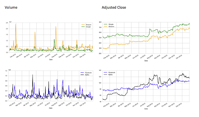
Data Visualization with Seaborn in Python: FANG Stock Correlation Analysis

Image
FANG, known as Facebook, Amazon, Netflix, and Google in the stock market, are considered very good investment in 2015. Thanks to the Python package Pandas and Seaborn, I am able to gather the adjusted close price and the volume on each day of last year of FANG stocks. 1. Volume and Adjusted Closing Price pattern of FANG in 2015 Amazon and Google has 3 significant peak volume in 2015. It's so interesting to see that the pattern of adjusted closing price of Google and Amazon are almost the same in 2015. It seems the Wall Street investors became confident in both Google and Amazon at the same time. 

How to Prepare for Tableau Desktop 9 Qualified Associate Exam

Image
Last week I passed the Tableau Desktop Qualified Exam, so I decided to give back to the Tableau community about my studying experience. I studied about 1-2 weeks for the exam, average about 2 hours per day, even though I had about 2 years user experience with Tableau.  The purpose of the exam is to test how much a candidate is familiar with the software instead of how good a candidate's visualization skills are. A post named ' Rumor has it...' in the community discussed about the fact that some candidates with few years working experience in Tableau failed the exam. If you are wondering if you should invest time and money in the exam (as it's quite expensive), I recommend to read my other post Why Do You Want to Take the Tableau Certificate Exam . 

Measure or Dimension?

From this article on the official guide it said ' For instance, you might calculate the Sum of “Sales” for every “State”. In this case, the Sales field is acting as a measure because you want to aggregate the field for each state. But measures could also result in a non-numeric result. For instance, you might create a calculated measure called “Sales Rating” that results in the word “Good” if sales are good and “Bad” otherwise. In this case the “Sales Rating” field acts as a measure even though it produces a non-numeric result. It is considered a measure because it is a function of the dimensions in the view'. (Link:  http://onlinehelp.tableau.com/current/pro/online/windows/en-us/datafields_typesandroles_dataroles_dimensionmeasure.html  ) I used the below query to create the field of 'Sales Rating': IF [Sales] > 2000 THEN 'good' ELSEIF [Sales] <=2000 AND [Sales]>500 THEN 'medium' ELSEIF [Sales]<= 500 THEN 'ok'  END It aut...